
By Anita, January 13, 2025 · 8 min read
The Impact of Mobile Optimization on Core Web Vitals and User Experience
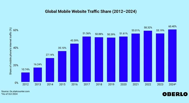
In today’s mobile-first world, having a website that performs well on smartphones and tablets is no longer just a nice-to-have; it’s a must. With mobile devices accounting for over 60% of global website traffic, businesses that neglect the mobile experience risk losing users, hurting their brand reputation, and falling behind competitors in search engine rankings.
Beyond simple convenience, mobile optimization is closely connected to Core Web Vitals (CWV) - a set of performance metrics defined by Google to ensure websites deliver a great user experience. Achieving strong CWV results can boost search engine rankings, make users satisfied, and drive better business outcomes. This article explores why mobile optimization is essential for improving Core Web Vitals and user experience, why it matters for SEO, and practical strategies to get underway.
1. What are Core Web Vitals?
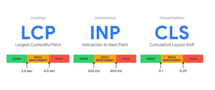
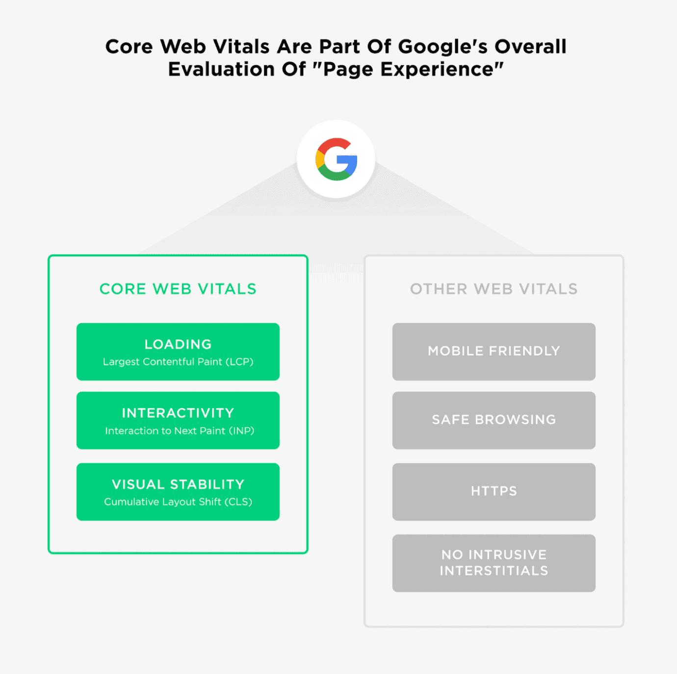
Core Web Vitals measure three key aspects of website performance that directly impact user experience. These metrics are especially critical in the mobile era, where challenges like slower connections and smaller screens are more pronounced. For an in-depth exploration of these metrics, check out our dedicated article: Understanding Core Web Vitals: A comprehensive guide to performance metrics. We’re presenting just the most important insights. Here’s a quick breakdown:
Source: web.dev
1. Largest Contentful Paint (LCP)
- Measures how fast the largest content element (e.g., a hero image or headline) loads.
- Target: Less than 2.5 seconds.
- Why it matters: A slow LCP can cause users to abandon the page quickly, especially on mobile where attention spans are shorter.
2. Interaction to Next Paint (INP)
- Measures how quickly your site reacts to a user’s interactions.
- Target: Less than 100 milliseconds.
- Why it matters: Delayed responses to clicks, taps, or scroll actions frustrate users and harm their perception of your website.
3. Cumulative Layout Shift (CLS) Measures how stable your page layout is during loading. Target: Less than 0.1. Why it matters: Unexpected layout shifts, such as buttons or text moving mid-load, create poor user experiences and can lead to mis-clicks.
Google uses these metrics in its ranking algorithm, making them a crucial element of SEO. Websites that nail these metrics are more likely to satisfy visitors and rank higher in search results, especially as mobile-first indexing remains a priority for Google. For a more detailed exploration, check out our full article linked above.

Increase E-commerce ROI
2. What Is Mobile Optimization?
Mobile optimization isn’t just about making things fit on a smaller screen-it’s about creating a smooth, user-friendly experience that keeps your visitors happy (and coming back for more). Think of it as upgrading your website to a mobile-first champion that users love to visit. Let’s dive into its key features:
- Mobile-friendly design: Layouts that adapt smoothly to different screen sizes (using responsive or mobile-first design principles).
- Faster loading times: Reducing code bloat and improving performance through efficient file compression and caching.
- Optimized images and videos: Using modern file formats (like WebP), lazy-loading off-screen images, and ensuring media are scaled appropriately for smaller screens.
- Cleaner code: Removing unnecessary scripts, CSS, and third-party trackers that slow down mobile load times.
- Enhanced Accessibility: Implement ARIA (Accessible Rich Internet Applications) attributes to make your site navigable for screen readers. Ensure your site has enough contrast ratios, resizable text, and intuitive keyboard navigation to ensure all users, including those with accessibility needs, can easily browse your site.
- Optimized Font Delivery: Use web font formats like WOFF2 for faster loading. Implement font-display: swap; to ensure text is visible while fonts load, and limit the number of font variants to reduce unnecessary requests.
- Advanced Caching Strategies: Utilize service workers to enable offline caching and faster repeat visits. Configure cache-control headers to ensure optimal use of browser caching for static resources. These strategies are particularly impactful for users on slower mobile networks or limited data plans, as they reduce the need to re-download assets, resulting in a faster, more efficient experience.
Source: TechStride Digital Innovate
Because over 60% of global website traffic now comes from mobile devices, a mobile-first approach in development is crucial. Research shows that users are five times more likely to abandon a site if it isn’t mobile-friendly (source: Optimize your website for mobile - Google Ads Help).
Source: thinkwithgoogle.com
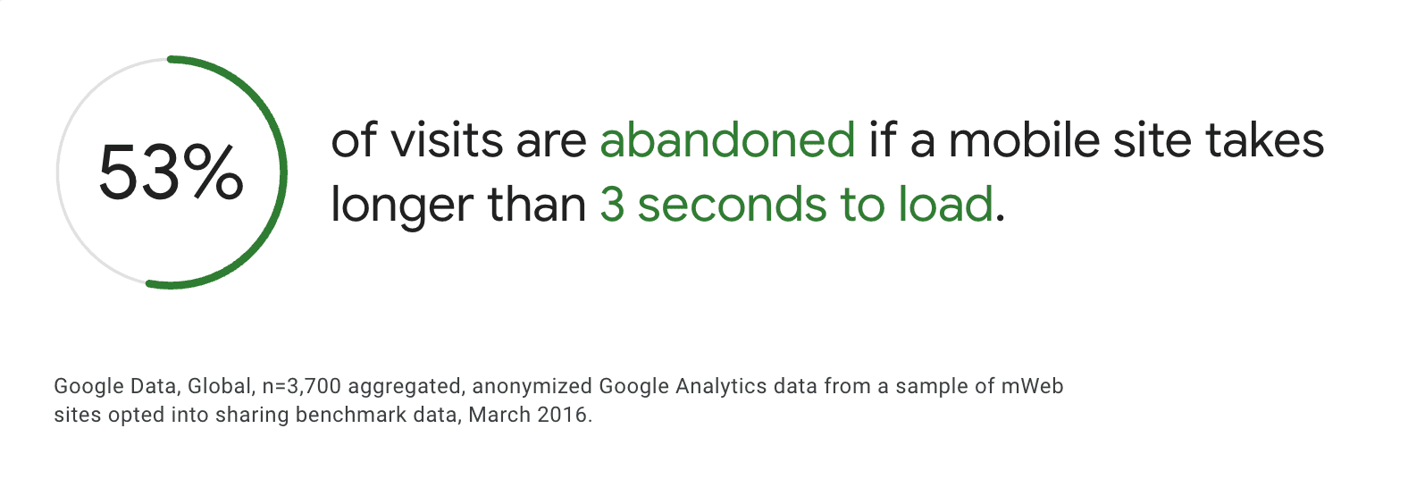
Google’s data shows that 53% of mobile users abandon a page if it takes more than 3 seconds to load (source: The need for mobile speed). In a world where attention spans are increasingly short, every second counts. Google also uses the mobile version of a website for indexing and ranking, so if your site doesn’t perform well on mobile, you risk lower search visibility.
3. How Mobile Optimization Improves Core Web Vitals
Mobile optimization strategies directly enhance CWV metrics:
Better LCP (Largest Contentful Paint)
By optimizing images, minifying code, and serving responsive content, you reduce the time it takes for the most important part of your page to load. Techniques like lazy loading ensure that off-screen images don’t slow down the page’s initial load time, helping your website appear faster to users.
Improved INP (Interaction to Next Paint)
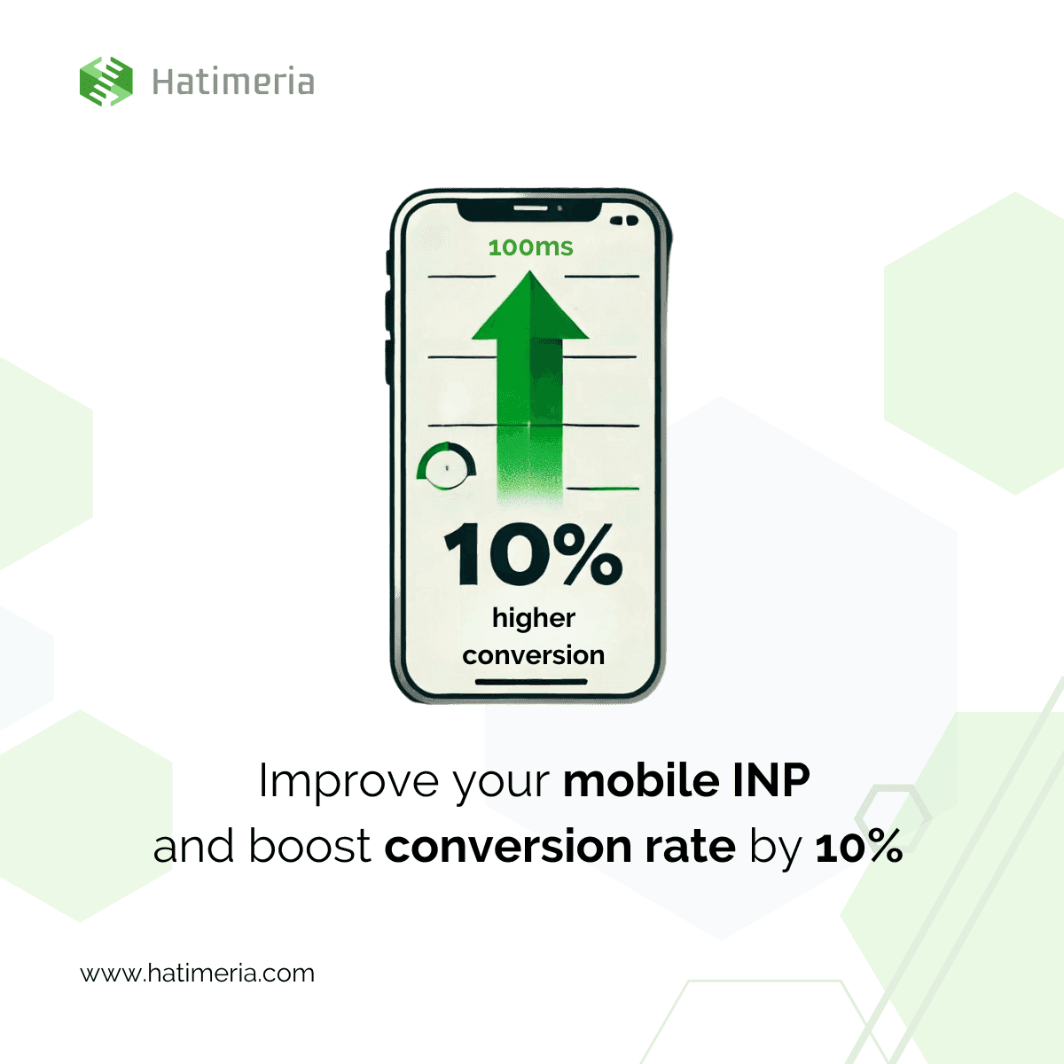
Mobile optimization often involves cutting down on heavy JavaScript and unnecessary third-party scripts. When your code is simple and loads quickly, your website can respond almost instantly to user actions. As a result, users experience less lag when clicking buttons, filling forms, or navigating menus.
Lower CLS (Cumulative Layout Shift)
Ensuring that images, videos, and ads have reserved spaces in the layout prevents content from shifting around as elements load. This is especially critical on mobile, where screen space is limited and unexpected layout changes can cause users to tap the wrong link or button.
Source: backlinko.com
4. Real-Life Example: DeeZee Project by Hatimeria
The DeeZee project by Hatimeria shows how mobile optimization can make a big difference:
- Mobile-Focused Changes:
- Simplified navigation and checkout for a smooth shopping experience.
- Used lazy-loading for images and optimized scripts to speed up loading times.
- Core Web Vitals Improvements:
- Faster load times (better LCP) and quicker interactions (improved INP).
- Lower bounce rates and smoother user engagement.
- Results: More mobile conversions and higher user engagement. Better stability during busy shopping times.

5. Why Core Web Vitals and UX matter
A fast, stable, and responsive mobile site leads to a great user experience (UX) - and great UX is directly tied to business success. Here’s why:
- Longer On-Site Engagement: Users are more likely to browse further and stay longer on websites that load quickly and respond smoothly.
- Reduced Bounce Rates: Slow load times or poor interactivity lead to frustration, causing users to abandon your site.
- Higher Conversions: Whether your goal is product sales, newsletter signups, or any other action, better performance encourages users to complete desired tasks.
- Customer Loyalty: Consistently providing a high-quality mobile experience builds trust, encouraging users to return for future visits and purchases.
6. Why businesses should care
In an era dominated by mobile usage, failing to optimize can have serious consequences:
- High Abandonment Rate: Slow-loading pages (>3 seconds) drive users away in large numbers.
- Lower Search Rankings: Poor Core Web Vitals scores can result in lower visibility in organic search, meaning fewer prospective customers find you.
- Lost Revenue: Reduced traffic and high bounce rates mean lost conversions and sales opportunities.
7. How to start optimizing for mobile
Ready to improve your site’s mobile performance and Core Web Vitals? Here are simple steps to get you going:
1. Audit Your Site
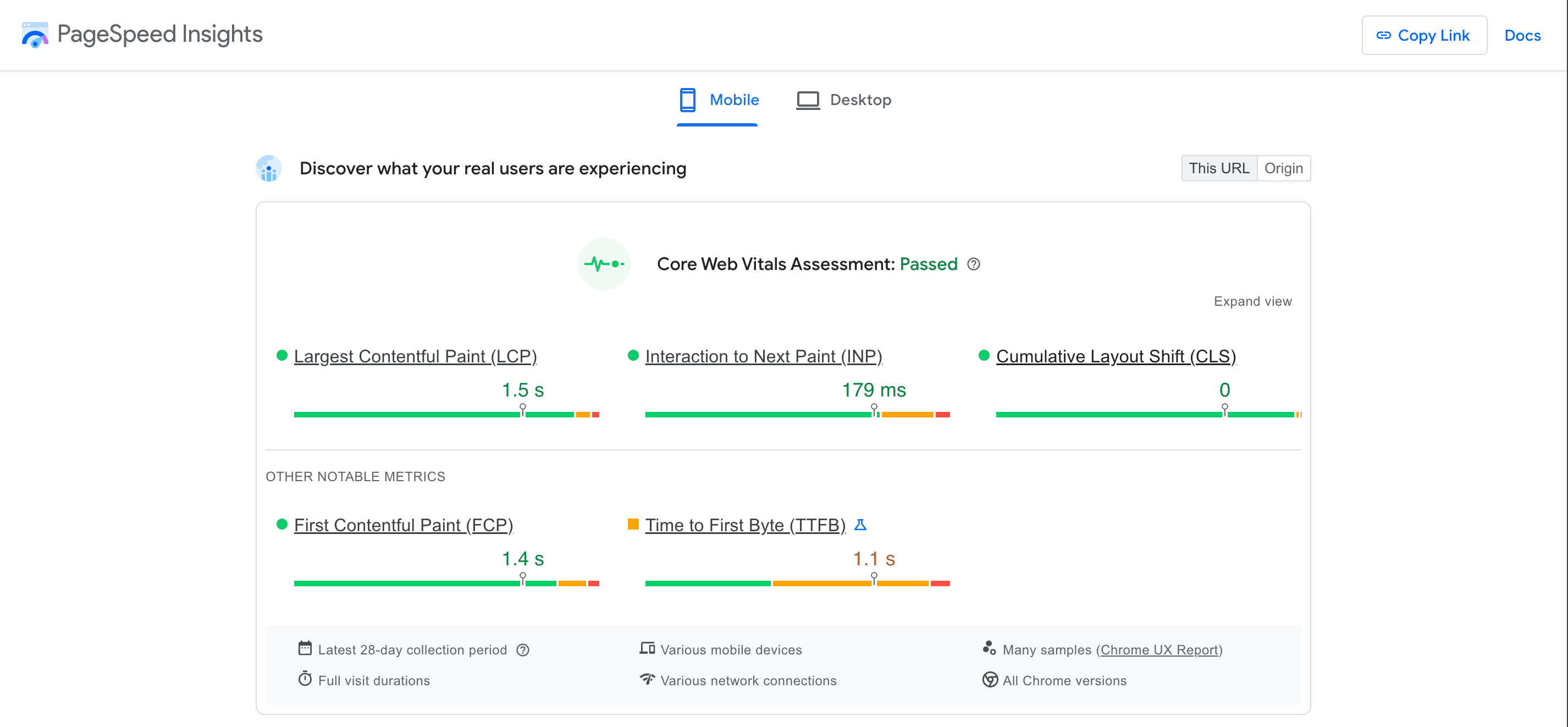
- Use Google PageSpeed Insights or Lighthouse to measure CWV metrics.
- Check Google Search Console for site-wide performance and indexing issues.
- Confirm your site is responsive using Google’s Mobile-Friendly Test.
2. Optimize Key Areas
- Speed: Compress images, minify JavaScript/CSS and enable caching,
- Layout: Reserve space for images and ads to avoid unexpected shifts (lower CLS).
- Interactivity: Break up long JS tasks to keep your site responsive (improve INP).
3. Test and Monitor
- After making changes, run the same tests to see if your CWV scores have improved.
- Test on various devices and network speeds to get a realistic view of user experience.
- Keep an eye on performance over time - optimizing is an ongoing process.
Conclusion
In today’s digital ecosystem, mobile optimization isn’t just about making a site look good on smaller screens - it’s about ensuring a smooth, fast, and stable user experience that meets Core Web Vitals standards. By doing so, you’ll improve search engine rankings, retain more mobile visitors, and in the end drive better business outcomes.
Transform your website into a growth engine! Mobile optimization drives higher rankings, more engagement, and bigger sales. Contact us to power your success!
Would you like to innovate your ecommerce project with Hatimeria?

Anita is a passionate Junior Fullstack Developer with 2 years of experience in Flutter, crafting mobile apps and websites. Her skill set also includes expertise in Node.js and Firebase. Now, she's excited to embrace new challenges and grow her career in fullstack development. Privately, Anita loves to make delicious Italian dishes, enjoying experimenting with flavors and recreating authentic recipes that bring a taste of Italy to her home.
Read more Anita's articles
