By Aleksandra, October 25, 2023 · 4 min read
Designing Experiences - Explore the Core Principles of UX Design
Two and a half decades ago, Jakob Nielsen established 10 foundational principles for interaction design. These principles, rooted in extensive expertise in usability engineering, have become widely accepted guidelines for human-computer interaction.
These principles remain relevant even today. They continue to facilitate early usability testing, enabling development teams to address more complex design challenges efficiently. Additionally, they serve as a valuable checklist for product and feature development, ensuring a comprehensive approach to design.
10 Usability Heuristics You Should Know and Follow (by Jacob Nielsen)
Visibility of system status
- The primary rule is to provide timely and clear feedback to keep users informed about ongoing events. By knowing the system's current status, users can observe the outcomes of their actions and anticipate future steps. A predictable design encourages trust in the product and brand.
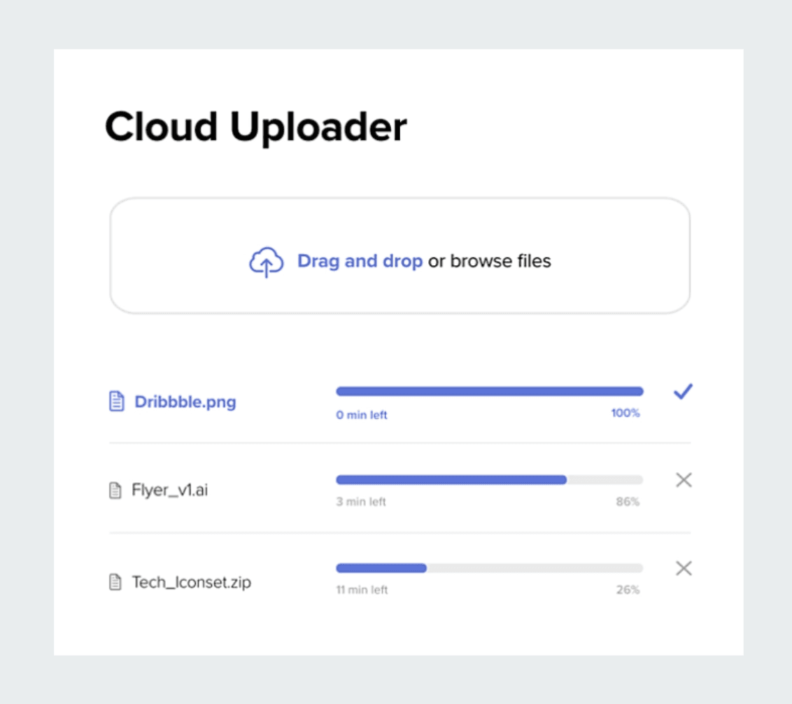
source: (https://dribbble.com/shots/7002312--UX-Design-File-Upload-Window)
Match between system and the real world
- Keep the system in the real world convention. It’s crucial for design to use language, phrases and icons that are familiar and understandable to the target audience. By following a logical order and incorporating illustrations that relate to desired outcomes, you can create an intuitive experience.

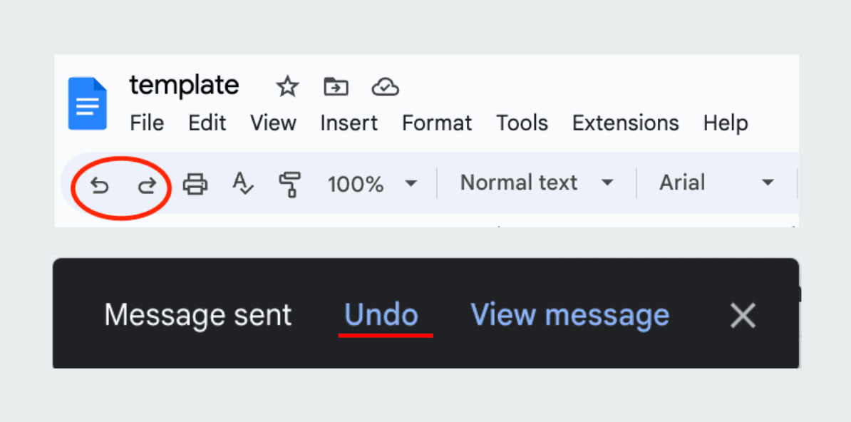
User control and freedom
- A good UI experience empowers users with control and freedom. Systems should offer suggestions and potential paths for users to follow, while refraining from making decisions on their behalf. Naturally, users may inadvertently execute actions in error, so it's crucial to provide a clear "emergency exit" option to quickly abandon undesired actions.
Consistency and standards
- Users spend most of their time on other sites. This means that users prefer your site to work the same way as all the other sites they already know
This quote emphasizes the significance of following industry conventions for external consistency. It includes placing common elements like login and cart icons in the right corner and the main menu at the top. Internal consistency is equally important, e.g, if we decide on orange for call-to-action buttons, we should avoid using the same color for other static elements.

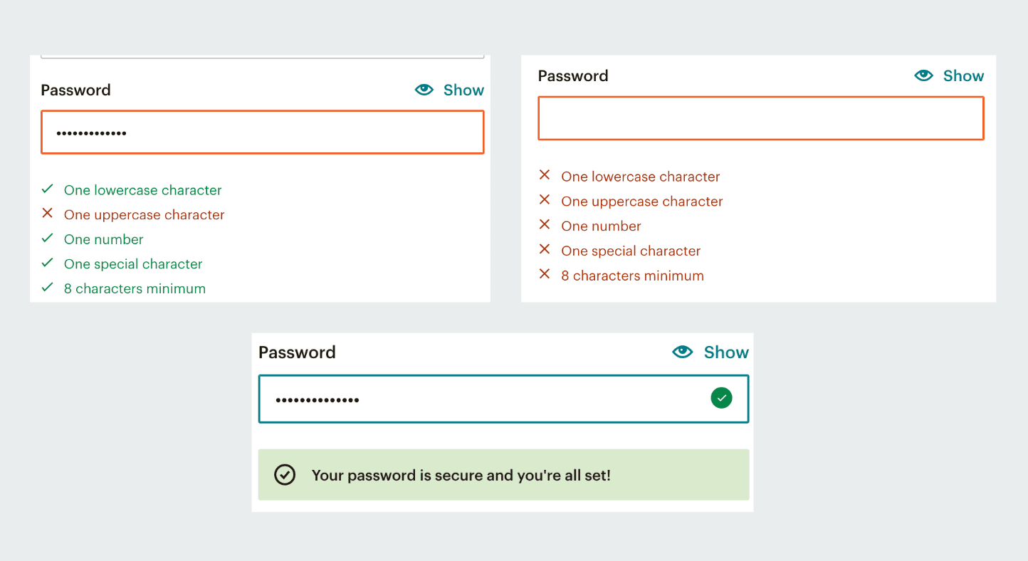
Error prevention
- Good error messages hold significance but superior designs proactively mitigate issues before they arise. This can be achieved by either eliminating conditions that are prone to errors or by identifying them and offering users a confirmation option before they proceed with an action.
source: https://www.amazon.com/cart?ref_=ewc_gtc
Recognition rather than recall
- Users should not be required to remember information from one part of the interface to another. Provide cues that help in the retrieval of information from memory and make sure that all necessary information for using design, such as field labels or menu items, is readily visible or easily accessible when needed.

source: (https://www.amazon.com/cart?ref_=ewc_gtc)
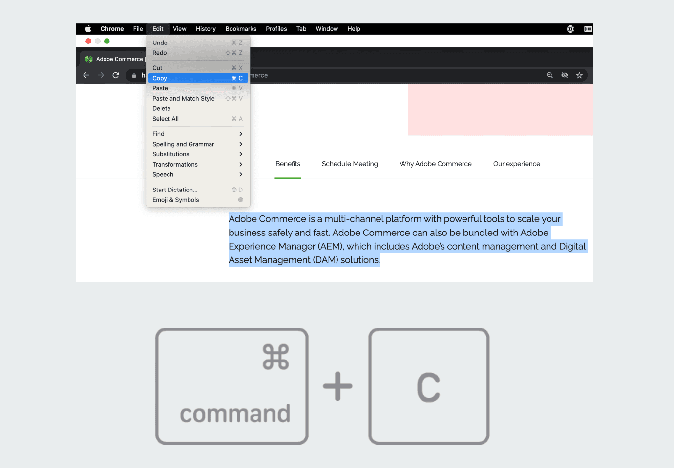
Flexibility and efficiency of use
- It's about designing systems that cater to the needs of users with varying skill levels. The offering of customizable shortcuts, advanced options and efficient workflows accommodates both novice and expert users. This principle aims to allow users to approach tasks in multiple ways, suiting their working style.
source: (https://support.apple.com/en-ph/HT209651)
Aesthetic and minimalist design
- Interfaces should not contain irrelevant or infrequently required information. Each additional information in an interface reduces the visibility of relevant content. It doesn't mean you have to use a flat design - it's about maintaining content and visual design centered around essential elements. Visual elements should support the user's primary goals.

source: (https://www.canva.com/learn/minimalist-design-beautiful-examples-and-practical-tips/)
Help users recognize, diagnose and recover from errors
- Help users in identifying, understanding and resolving errors. Error messages should be conveyed in clear language (avoiding error codes), accurately indicating the problem and offering constructive solutions. Furthermore, these error messages should be accompanied by visual cues to enhance user attention and recognition.

source: (https://wordpress.com/go/tutorials/how-to-optimize-404-error-page/)
Help and documentation
- Ideally, the system should be self-explanatory without requiring additional clarification. However, documentation may be necessary to assist users in completing their tasks. Help and documentation should be easily searchable and centered around the user's objectives.
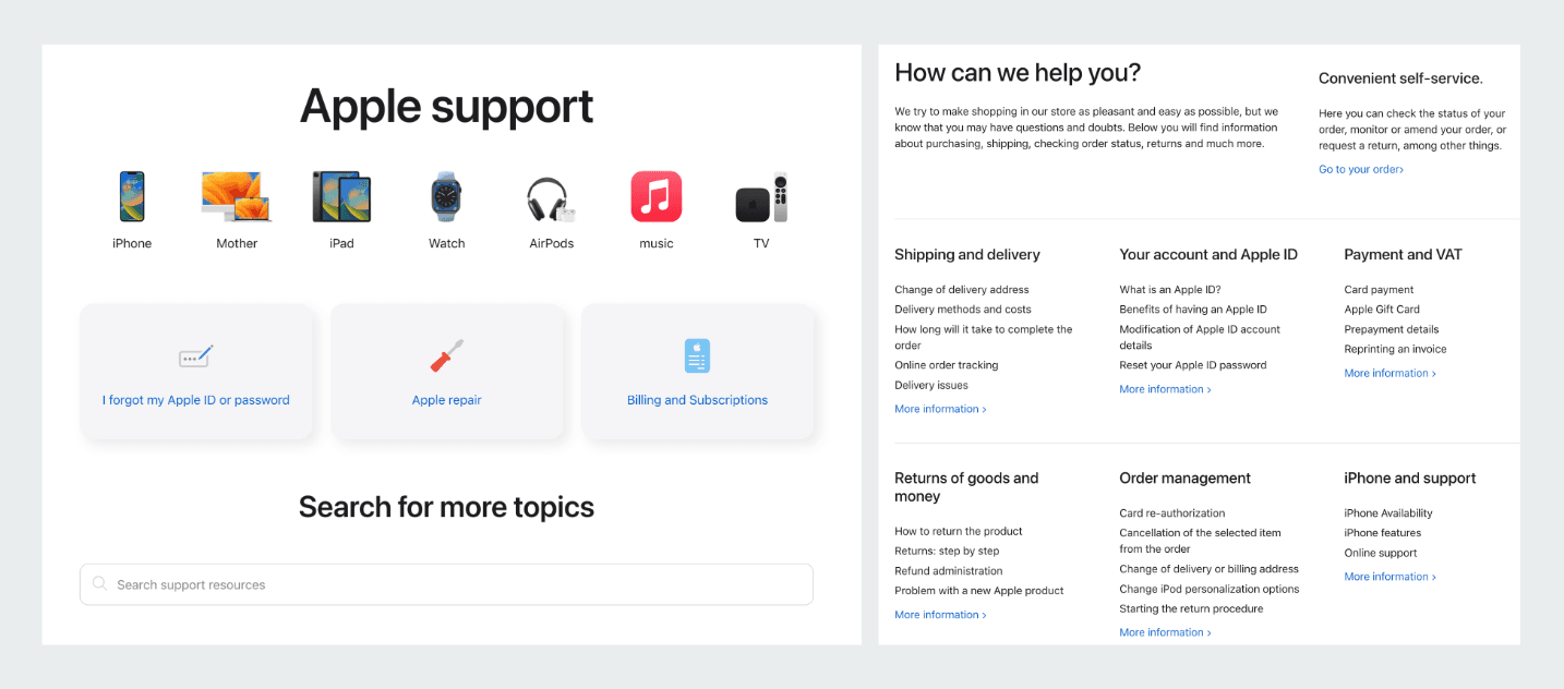
source: (https://www.apple.com/pl/shop/help)
These principles serve as guidelines for creating user-friendly and enjoyable experiences but it's important to adapt them to specific contexts and user requirements.
source: (https://www.nngroup.com/articles/ten-usability-heuristics/)
Would you like to innovate your ecommerce project with Hatimeria?

A fierce bug hunter and QA specialist. At work and privately, she loves challenges. Endless new ideas don’t let her get bored. As an open mindes person, she enjoys family time, summer trips and live music.
Read more Aleksandra's articles


